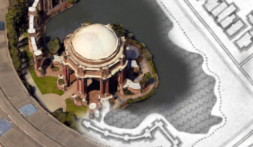
Hero Map
Gamified visualization of your Google Location History

This university website is meant to showcase some of my free time projects completed while studying at the University of Edinburgh.
This is not my complete portfolio — see my CV and GitHub for more...

Gamified visualization of your Google Location History
Pushing my UI & front-end skills to the next level...
Web app built during HackTrain hackathon (November 2016)

Mobile app built during HackUPC hackathon (October 2016)
Facebook London Hackathon project (March 2016)
5 day hackathon in Edinburgh (February 2016)
Visualizing the graph of my Facebook connections...

24 hour hackathon in Cambridge (January 2016)
24 hour hackathon at JPMorgan Glasgow (November 2015)

Hero Map took several months to develop, and is most likely my largest free-time project so far. The idea of a real world map that you slowly reveal as you physically walk around was too complex to be executed during a hackathon so I decided to properly build it myself over a longer period.
The app uses Apache Cordova framework and is built entirely using JavaScript and web technologies.
Currently, the Android version of the game can be found in Google Play Store.
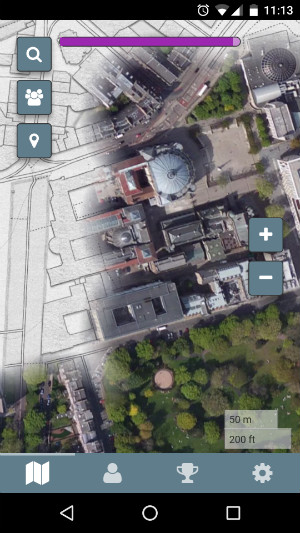
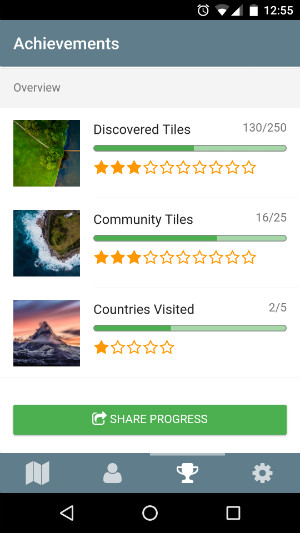
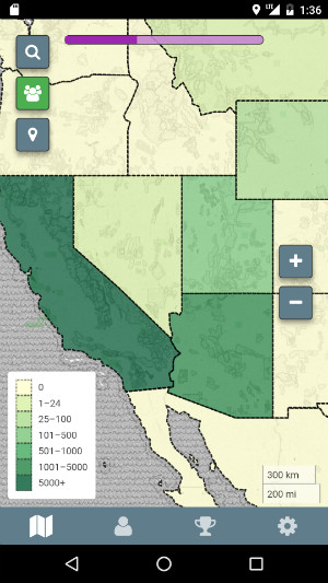
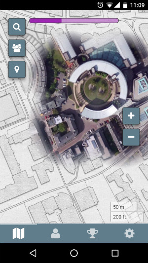
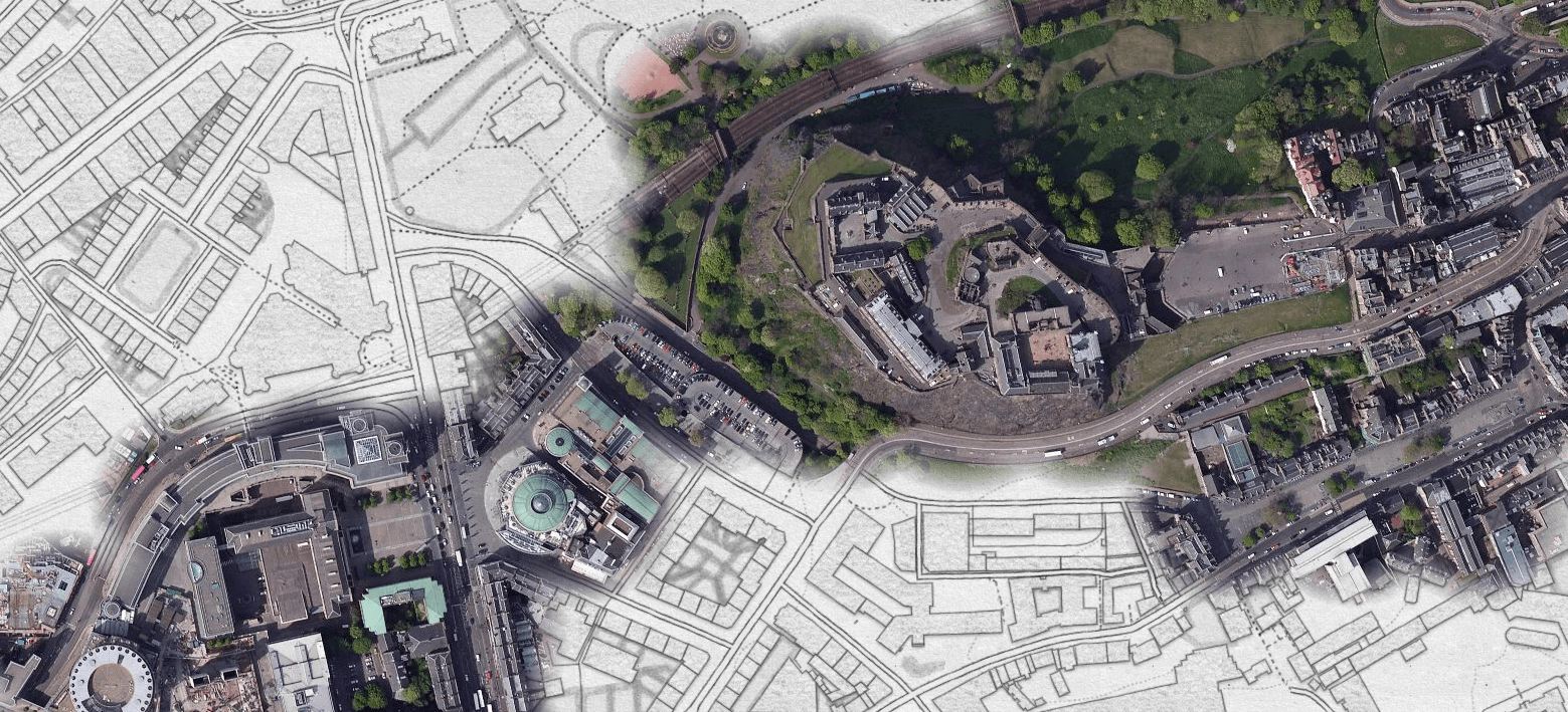
More than a year after the release, an idea emerged that the Location History data saved by smartphones with connected Google accounts could be used to construct the same map directly, but this time with one's lifetime location history.
Due to API restrictions it had to be turned into a desktop app based on the Electron framework.
In Februrary 2018 I successfully released Location History Map Explorer for both Windows and MacOS.
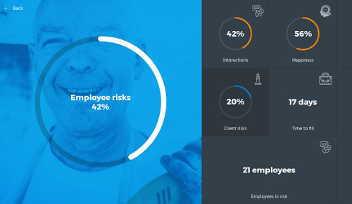
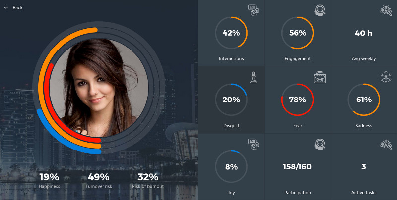
Based on a theme My Personal Risk Advisor we built a web app analyzing employee-associated risks within a company. I developed the front-end from scratch, using React.js as the only user-interface framework.
Find the code on GitHub.
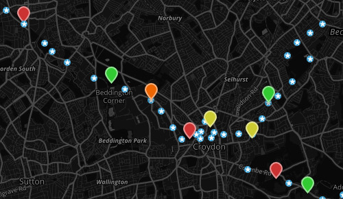
During the HackTrain 3.0 hackathon, we built a data visualisation tool using the Travel for London dataset of tram line occupancies. It reconstructs the tram lines on a map and shows an animation of the whole system.
Video here: https://www.youtube.com/watch?v=jNLT8DRtJNo
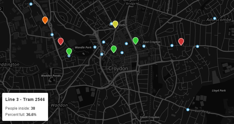
The dataset contained a list of tram arrival and departure events with the trams' current occupancies. We first used Google's Geocoding and Directions APIs to reconstruct the tram lines on a map and then simulated the whole tram system.
Find the code on GitHub.
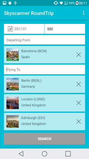
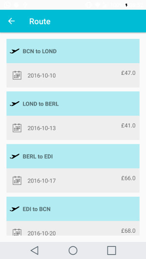
At HackUPC 2016 we built a mobile app that allows you to plan a multi-day trip to visit several cities, and finds the cheapest flight combinations by using the Skyscanner API.
When you go on a trip around Europe and want to see multiple cities, it's difficult to predict which combination of flights would produce the cheapest option and which days are most suitable for travel. With our mobile app, all you need to do is to input all the cities you want to visit, and we'll do all the hard trip planning for you.

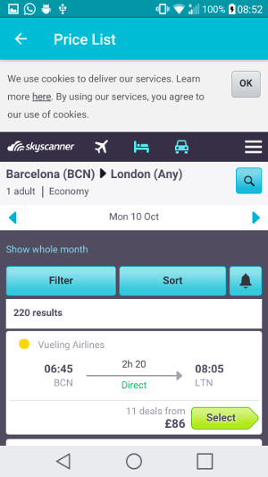
During the hackathon we also built a Twilio-powered service that sends you a map of your surrounding area after receiving an SMS with your geo-coordinates. We implemented all data exchange on top of standard SMS service so it works even when you are offline and have no Wi-Fi or mobile data.
Find the code on GitHub.

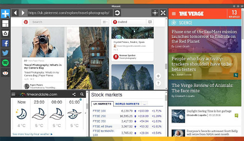
Mosaic is a Chrome app that creates a fully customizable split-screen browser layout. It was built during the Facebook London Hackathon (March 2016) and is now available in the Chrome Web Store.
Users have the ability to add, delete, resize and drag & drop webpage views.
User session is stored in Google Cloud so that reopening the app always restores the last opened web pages.
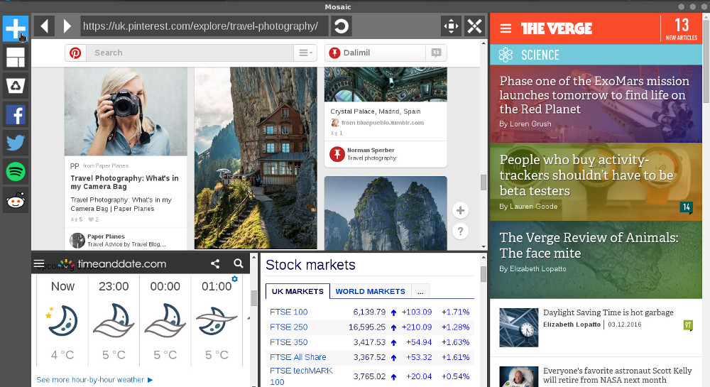
The representation of the layout is implemented as a binary tree.
All operations (such as resizing, adding, deleting or moving windows) are implemented as functions that modify this tree and often involve recursive traversals. For example, action 'resetLayout' is a function that rebuilds the whole tree using breadth first search and adding new nodes/views layer by layer.
Find more on GitHub.
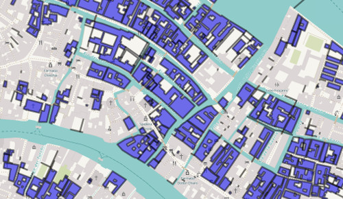
During a 5-day long hackathon in Edinburgh (Feb 2016) we built a visualization tool for the history of additions and changes in OpenStreetMap. Our project uses latest OSM data (obtained dynamically via an API) to display history of contributions to the map in a given area.
Video here: https://www.youtube.com/watch?v=WzWmvNUBAPs
Everything is rendered on top of current OpenStreetMap tiles. We allow the user to click through and view changes done in a given time period and we also provide a 'play button' to show an animation.
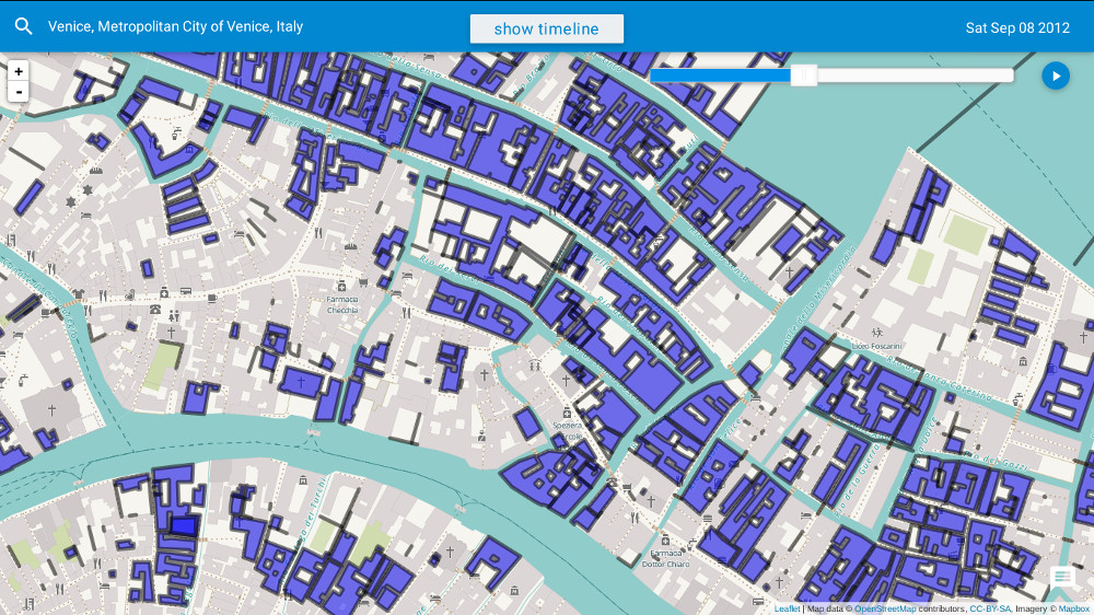
In addition to that, we extended our map by creating a layer with available water points in Africa. This allows anybody to easily find close water sources. Although we focused on water wells, this idea can be easily extended to show any kind of information recorded in OSM data, such as hospitals, landmarks, railways,...
Find more on GitHub.
I thought it would be cool to visualize a graph of people who are my friends on Facebook. Nodes would represent people, with an edge between two nodes whenever those two people were friends.
First of all, I had to get the data set - I needed to get the 'friend list' of every user that I am friends with. Unfortunately, Facebook API does not support this. It did support it to some extent in the past (API v1.0) but due to privacy concerns this functionality has been removed (since API v2.0 - April 2014).
The only option left was to write a script that would log in to Facebook and crawl the network graph.
The toughest problem was to get a list of friends for a single user - Do you know how Facebook only shows you the first 20 friends when you visit somebody's profile? How you need to scroll down and wait until Facebook asynchronously pulls more friend profiles in the background? That was challenging to do in code...
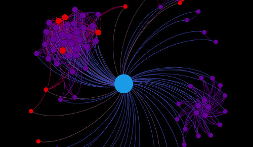
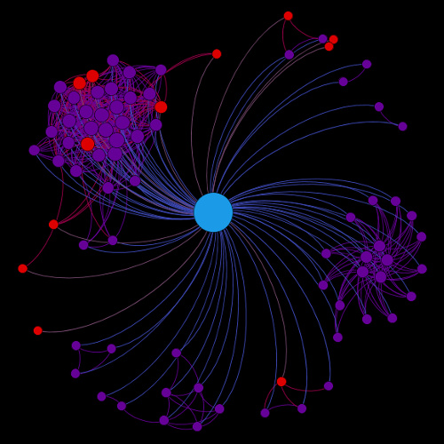
When I finally had the whole graph of my Facebook friends, I produced a DOT language file as output. I then used Graphviz to visualize the graph, but instead of using dot, the default graph layout mode (which works particularly well for hierarchical graphs), I used circo. Circo is a graph layout program (still part of the Graphviz package) for circular layouts. It identifies biconnected components and draws the nodes of each component on a separate circle. Edge crossings within a circle are minimized by placing as many edges on the circle's perimeter as possible.
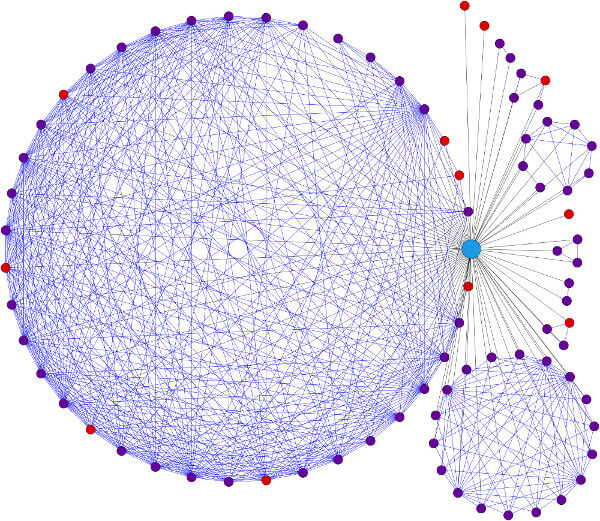
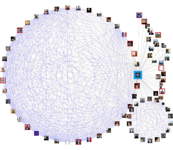
I was blown away by the results! The graph very clearly showed groups of people that had strong connections among them (connection = 'be friends with'), such as people from my secondary school, people who are part of the same university society etc.
It was very interesting to find these patterns only by looking at the connections between my friends. In other words, the clusters of nodes could be very well mapped to real life social groups. Another interesting observation is that even if you keep your friend list private (= red dots), you can be easily placed into a 'group' based on the connections that your friends reveal.
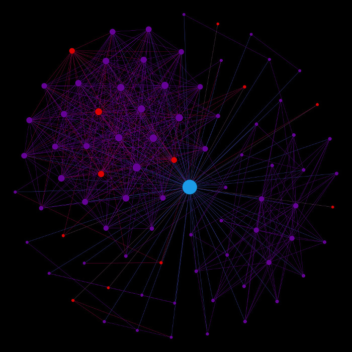
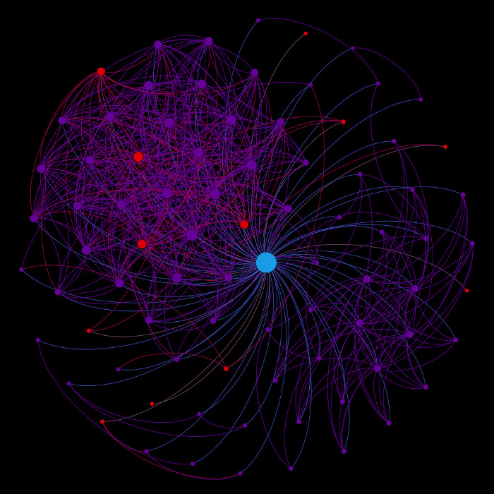
Finally, I experimented with another graph drawing tool - Gephi. It implements several force-directed layout algorithms, such as Fruchterman-Reingold, but I found the results less appealing (in terms of their layout) than those generated by Graphviz. See for yourself...
Hack-Cambridge was a massive student hackathon with almost 400 participants. It was organized by the University of Cambridge in January 2016. Several companies presented their challenges, often based on their APIs or product, but people were free to work on something else as well.
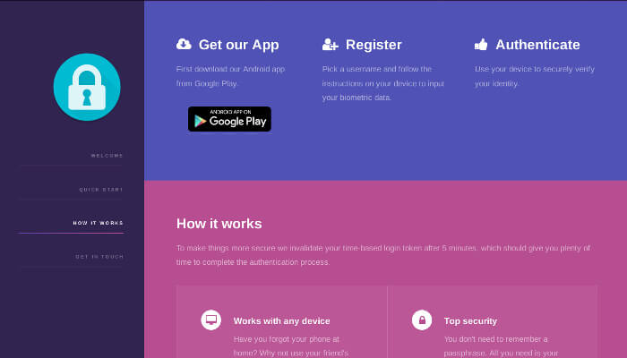
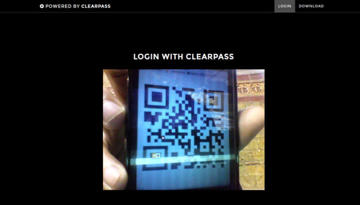
Our team of four people decided to tackle the Thales Security Challenge, which was to create an innovative security solution using today's technology. After 24 hours of coding and one hour of demoing, we successfully became the winners of the challenge.
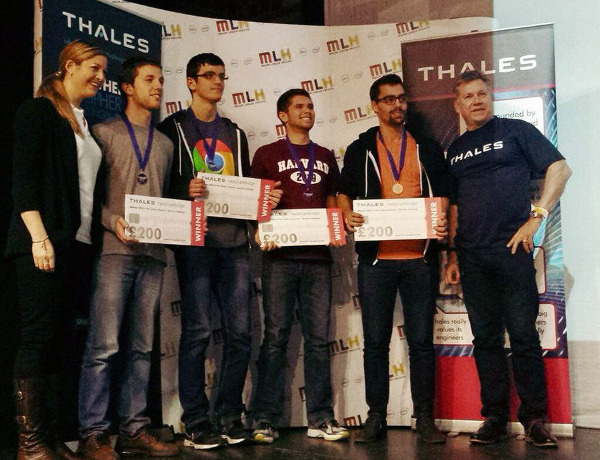
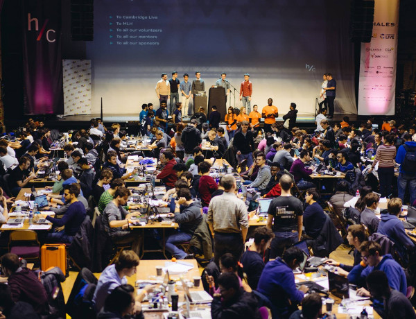
Find more on GitHub.
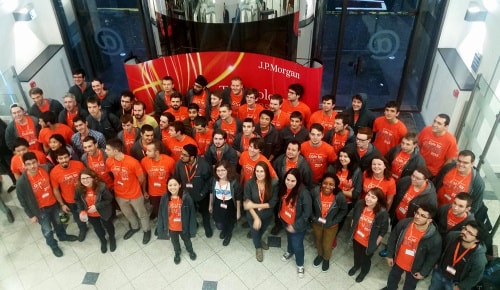
Code for Good was a weekend hackathon in Glasgow (Nov 2015) organised by JPMorgan Chase, where student teams tackled challenges presented by three non-profit organizations.
Our team developed a web application for Urban Roots that allowed volunteers to sign up and choose projects that they wanted to take part in, with a map showing opportunities in their local area.
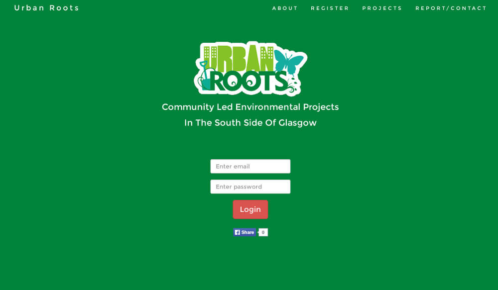
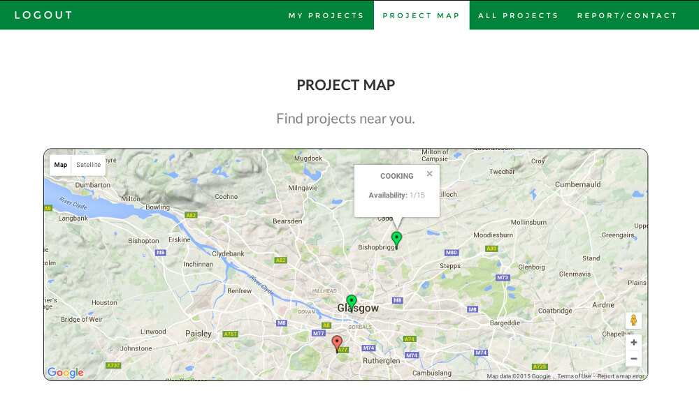
We also made an Android app that provided similar functionality but also allowed anyone to report vandalism by simply taking a photo. An admin section on the website allowed anyone from Urban Roots manage existing projects, get in touch with volunteers, and also see a list of reported issues.
Find the code on GitHub.
The aim of my Facebook 2015+1 project was to create 2015+1 Facebook posts. Each post shows a single number from 0 to 2015 (and the numbers are obviously in sorted order).
At first, it seemed that the most straightforward solution would be to use Facebook’s Graph API Explorer or perhaps to obtain the Access Token via a custom-made Facebook application. However, when using the Facebook API you are limited to about 10 posts per day. Clearly, this wasn’t the way to accomplish the task.
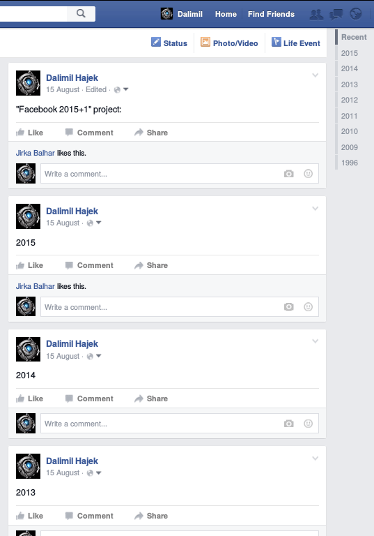
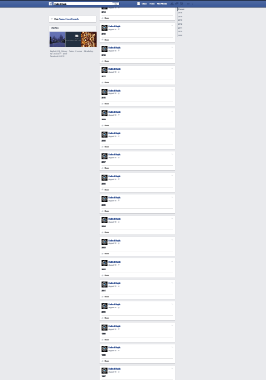
What I eventually did was to programmatically imitate a real user signing into Facebook and posting posts by sending HTTP requests in a similar way a web browser does. Still, there were some more issues such as Facebook’s spam filters or posts not showing in the correct order. These have all been dealt with. Tadaaa...
Video here: https://youtu.be/iLEuyY9VBaU